

Design Lead

Initially ThriveOn had a website which hosted editorial videos online. As their audience grew, they were in need of a mobile app, where users could watch their published editorials, at their leisure.I was brought on by the Operating Advisor and CTO, to strategize a new vision for Thrive. I was the sole designer on the team. And many times, I was creating marketing media on top of the product design.
Combined with user and market research, developing a new visual language, and the product design itself, I was able to create an overall synergistic experience.
the problem
Thrive delivered content to a wide audience globally. The problem was navigating to their content. Their one website contained walls of text, and what they called "13 Sectors." It was unclear what these sectors of interest were, and how they pertained to the video content. Their visual language was outdated. And yet they still were building on to what was a very difficult site to navigate. Users could not access their content from a mobile app, and the site was not mobile friendly.
Likewise, this was during the pandemic, and users were craving social interaction around their media, outside of Facebook Groups.
the task
From the ground up, Thrive needed a new, fresh mobile app, that integrated video streaming with social interaction. The 13 Sectors were important to the stakeholders, so the challenge was integrating in such a way that users got value from them.Since the launch of the mobile app was aligned with the launch of their next video launch, we had to work quickly, not only designing the product itself, but custom iconography, and marketing collateral, as well.
my role
- User Research
- Personas
- Competitive Market Research
- Journey Mapping
- Collaborate with Stakeholders to Define Priorities
- Work with Data Analysis
- Information Architecture
- Sketching
- Digital Wireframing
- Experience Flows
- Protoyping
- User Testing
- Illustration
- Graphic Design
discovery
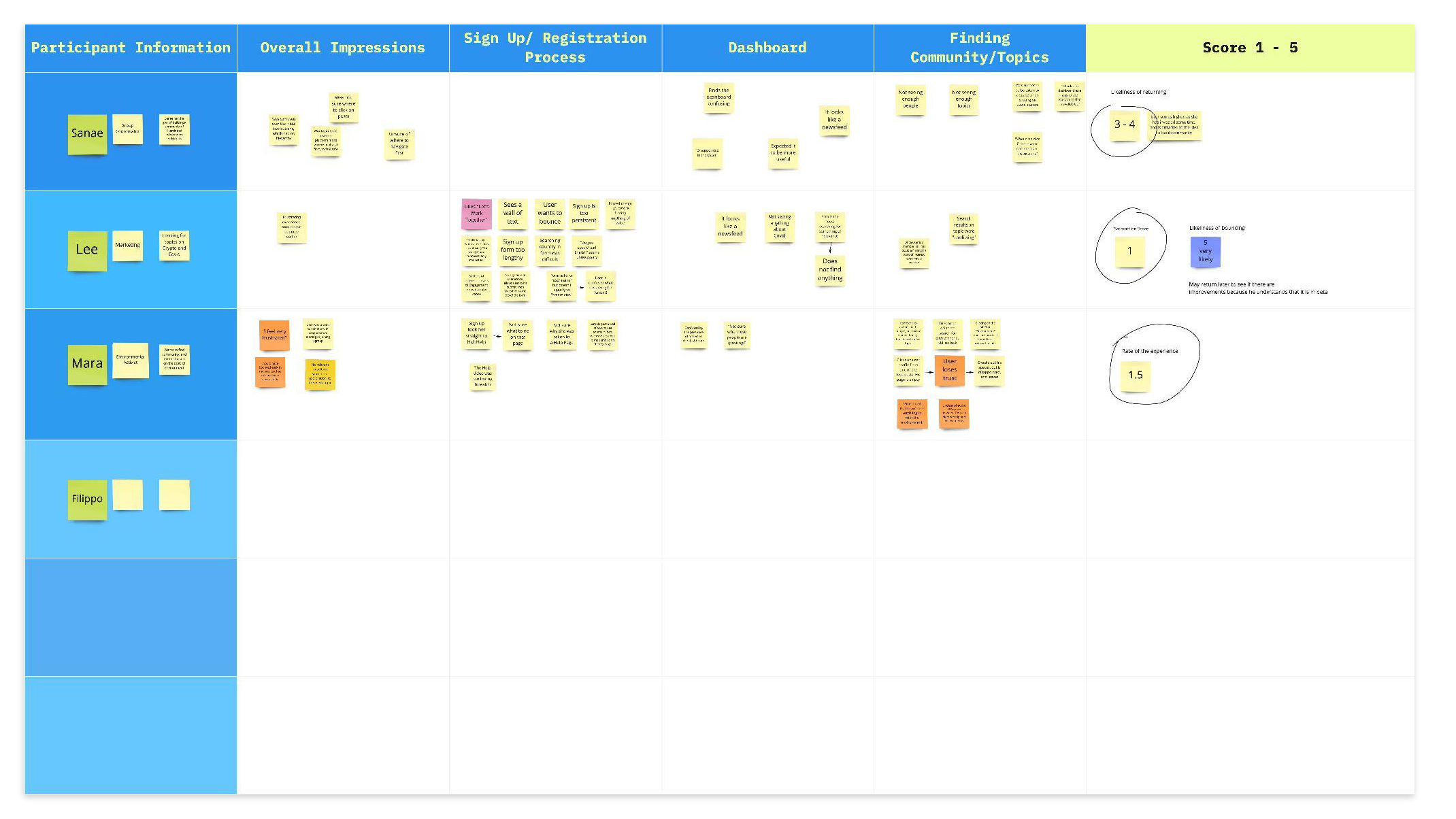
The Operating Advisor and I worked collaboratively, conducting competitive market research, defining recurring UI patterns, and what users' mental models are for navigating streaming video, communicating socially online, and registering for events.We conducted user interviews, and ran moderated user walkthrough studies, and heat map studies, as well.
user study data matrix
key takeaways
- Users are looking for people
- Finding real people legitimizes the experience more
- Users want to find people who are connected through interests
- Current UI makes it difficult to find people with like interests
- 13 Sectors are misunderstood by the users as superfluous information,
however they could be a helpful tool, if utilized properly to facilitate
connecting people via their area of interests, making them easier to find
user personas
I wanted to create a sense of empathy for our team and stakeholders, so I created the personas in social media cards, to give a sense of that, "I might just know that person" feeling.

definition
I created documents such as scenario maps for the team so that we could be aligned on how we perceived the users to interact with our product. As we worked through them, and defined scope closer, I delivered documents such as user flows and architectural site maps

visual mood board
Because I was also working on the Visual Design, as well as the structure and architecture, I created Visual Direction deliverables, as well. I took an empathetic approach through the entire journey. The colors, shapes and styles were chosen based on what the key take aways were from user studies, and what kind of experience they wanted.

style tile

ideation
Many sketches were executed, then brought into Figma for Rapid Prototyping, in the form of lo-fi wireframes.
digital wireframe iterations
visual design
pattern library
ui design


